
Human Nature | expo 2031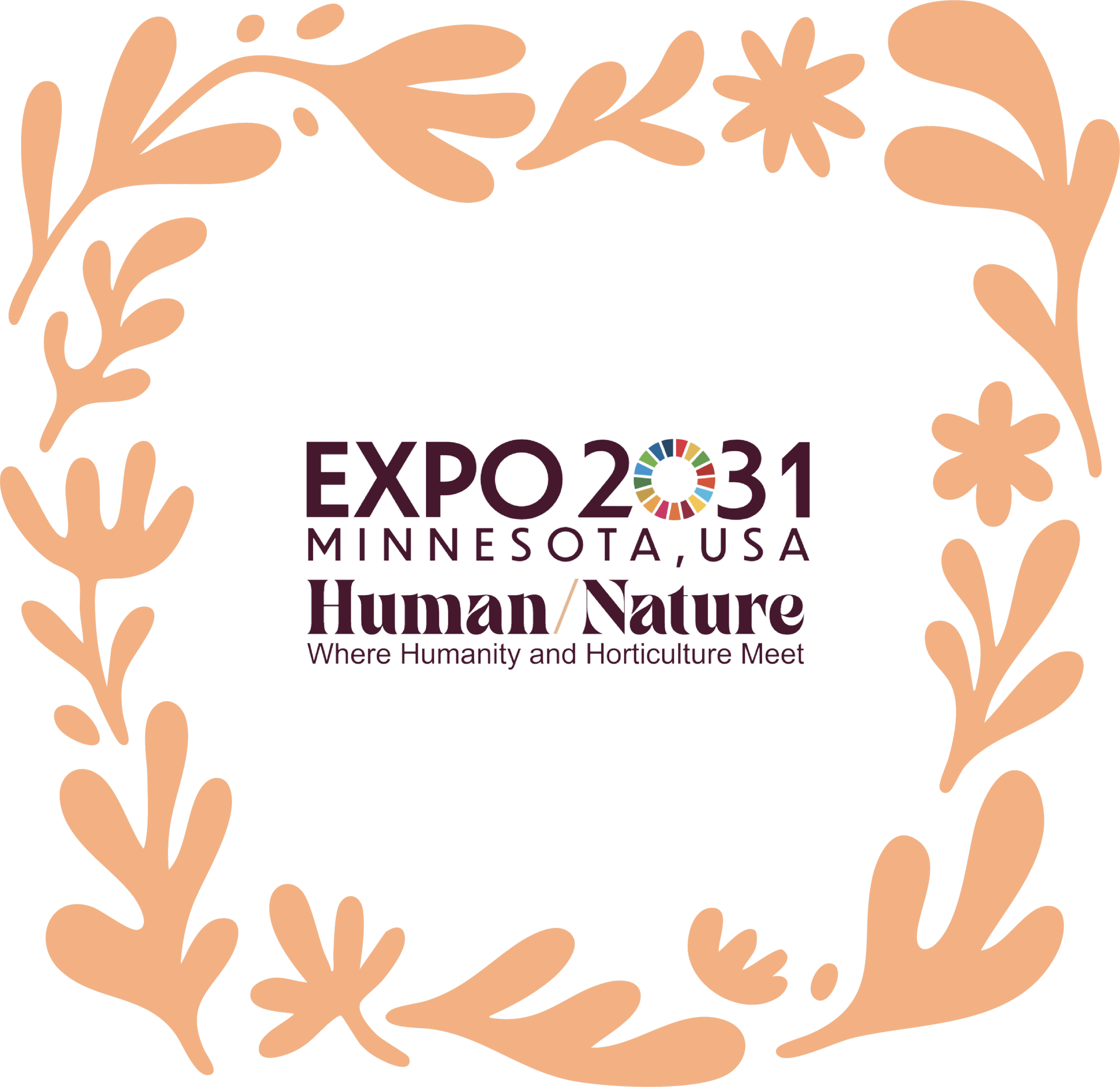
Year: 2025
My role: Creative Direction, UX/UI & Presentation System Design
Team: Modern Climate
Visual Identity
Experience Strategy
AI Avatar
Information Architecture
Presentation System
Motion Design
Accessibility
The Situation
Minnesota was competing to host the World Horticultural Exposition 2031. Existing materials were dense and inconsistent; we needed a single deck that felt inspiring and credible across 19+ chapters (theme, master plan, programming, visitors, transport, finance, legacy).
The Task
Design a modular, WCAG-aware presentation system that leaders could skim in seconds and trust in minutes, and that would scale across digital, construction, and print as the bid advanced.
Previous materials were dense and visually inconsistent. We needed a deck that was both inspiring and credible, effectively mapped the entire plan, and could scale across digital, construction, and print as the bid progressed.
The Action
To create a cohesive, reusable deck that accelerated alignment, shortened review time, and made the proposal tangible at human scale—positioning Minnesota convincingly for Expo 2031 while giving the team a system that scales from screens to signage to print and beyond.
What is Expo 2031
(and why this is a BIG DEAL)
Expo 2031 Minnesota, USA is a planned A1 World Horticultural Exposition—a six‑month global event (May–October 2031) proposed for Dakota County, Minnesota.
After the presentation, it was approved; now being the first A1 World Horticultural Exposition ever hosted in the United States, convening international participants across horticulture, urban greening, food systems, technology, and well‑being under the theme “Human/Nature — Where Humanity and Horticulture Meet.”
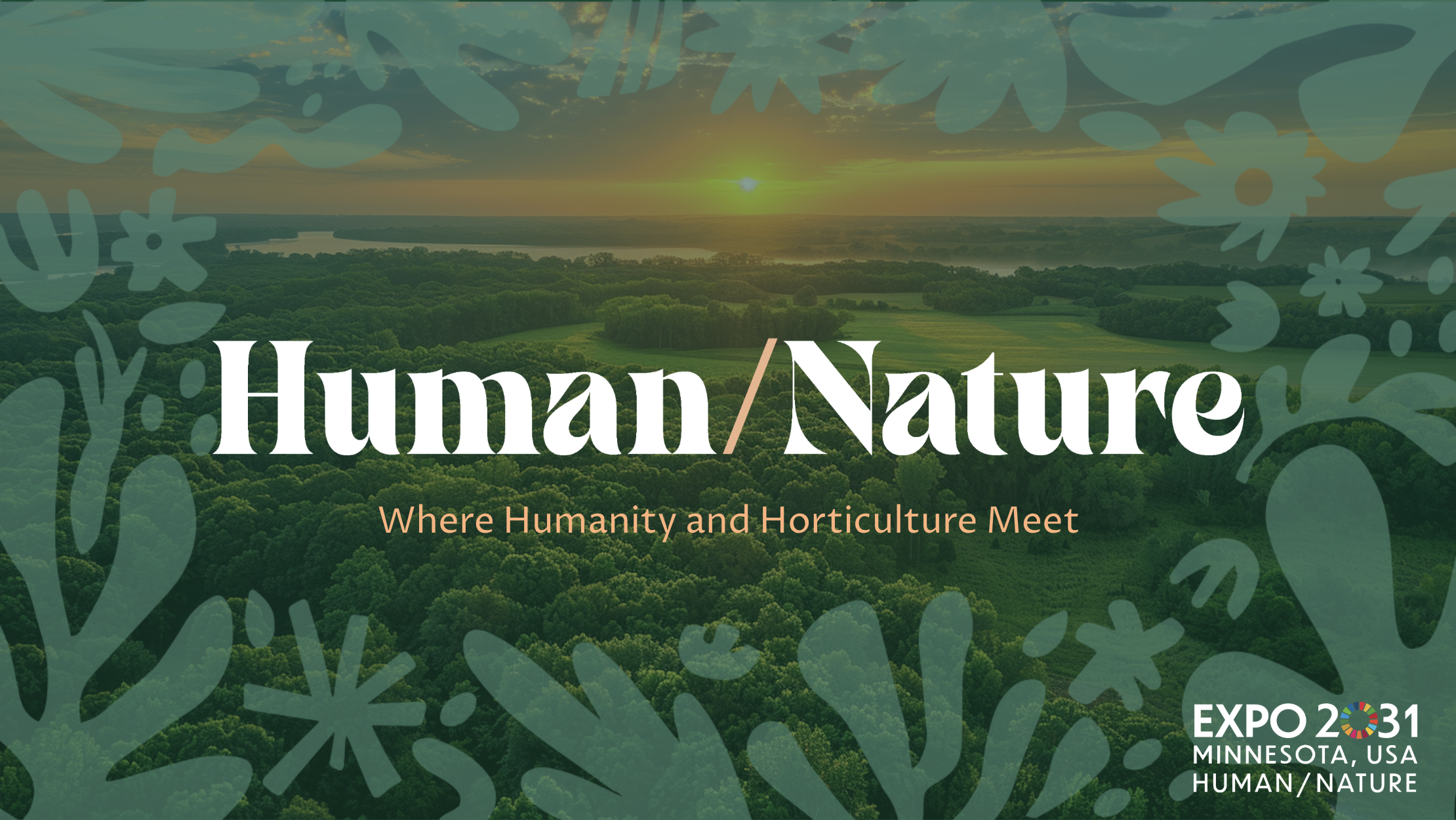
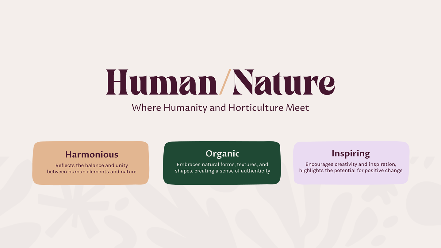
Blends botanical warmth with modern clarity.
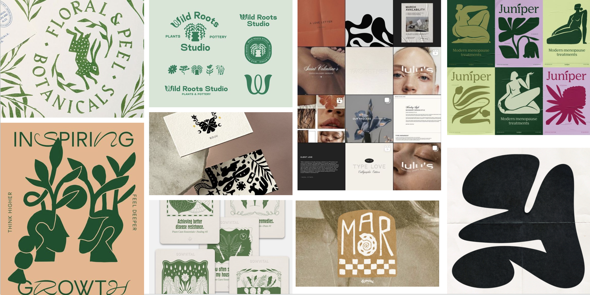


Creative Summary
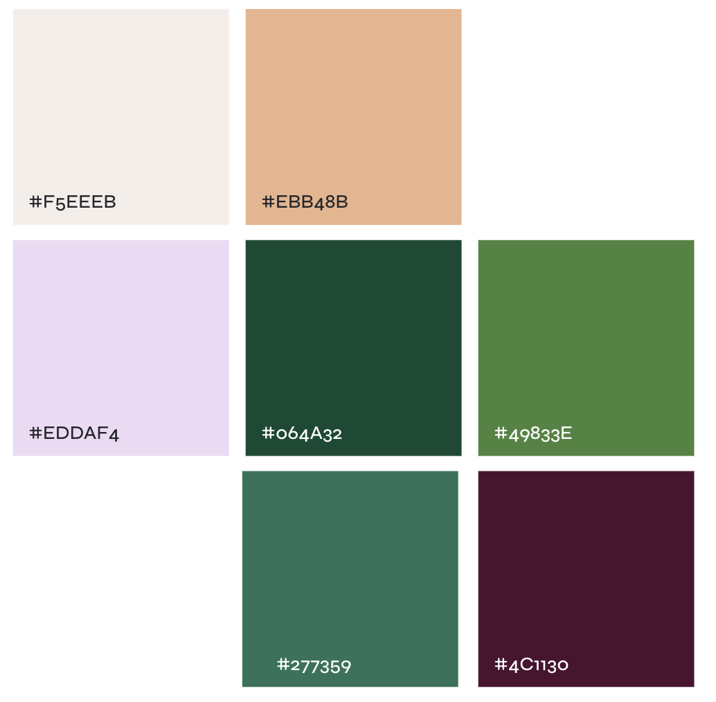
The palette anchors in deep evergreen with supporting greens and then lifts with petal tones—peach, lilac, and a soft canvas—plus a plum accent for depth.
Organic, cut-paper shapes echo leaves and garden beds, giving chapters and wayfinding a human, handcrafted feel that still scales across digital and print.
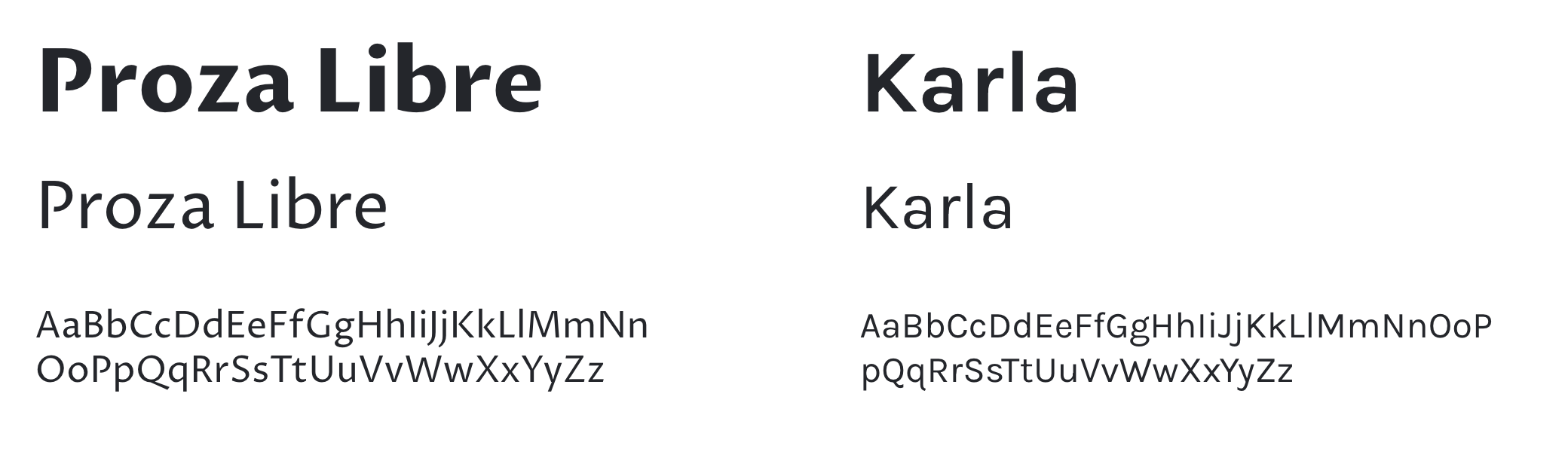
Typography pairs Proza Libre for expressive headlines with Karla for clean, readable body copy.
Together, the colors, forms, and type create a voice that feels rooted and optimistic, perfect for an Expo that invites the world to see where humanity and horticulture meet. This styling guide encompasses everything from presentation cards and maps to signage, merch, and social media templates.
In total, the application guide is 96 pages.


Image generation
AI images pre-visualize wayfinding and brand at a human scale, so decisions on layouts, materials, and accessibility happen faster. Assisting in visualizing upcoming construction goals.
Human/Nature is our north star—showing how people and horticulture meet in Minnesota.
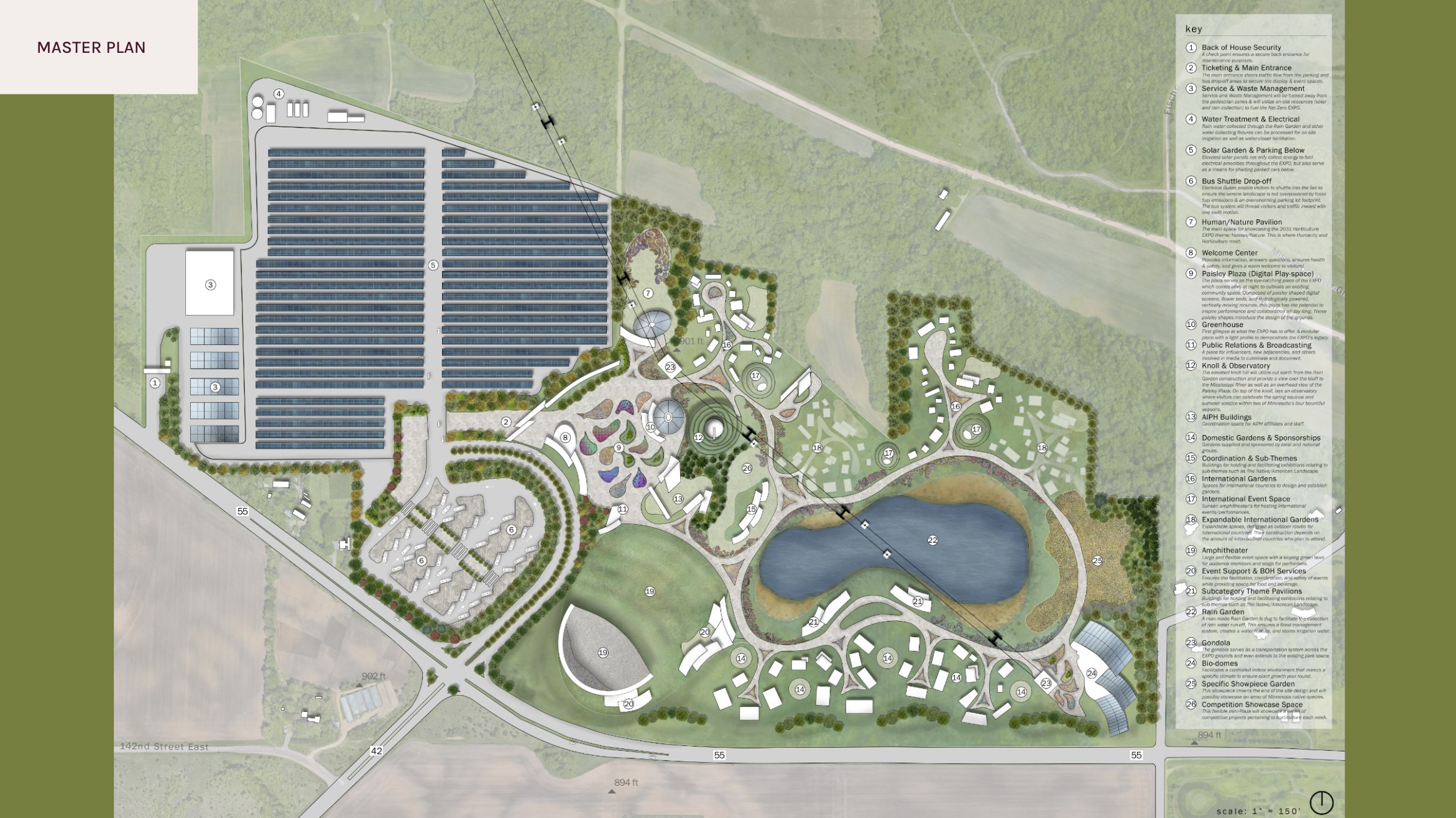
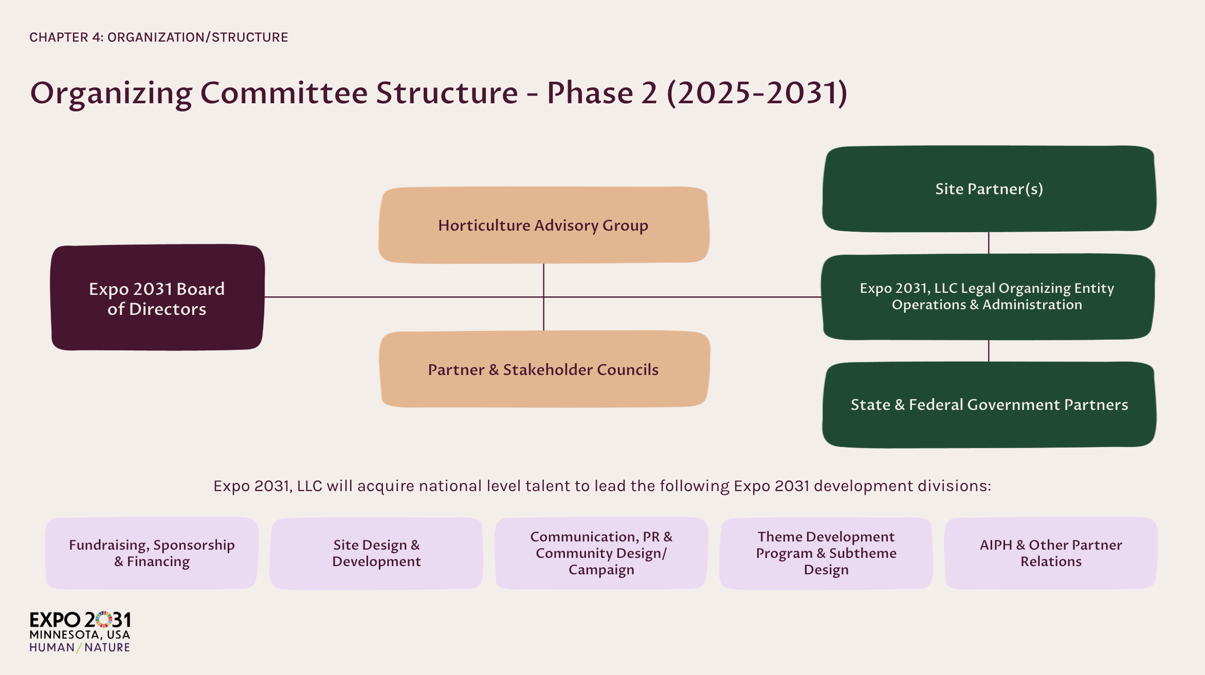
I rebuilt the bid as a modular system so leaders can skim in seconds and trust in minutes. We open with tone—Organic, Inspiring, Harmonious—then move into Place and Plan: a clear master plan with consistent legends and pathways.
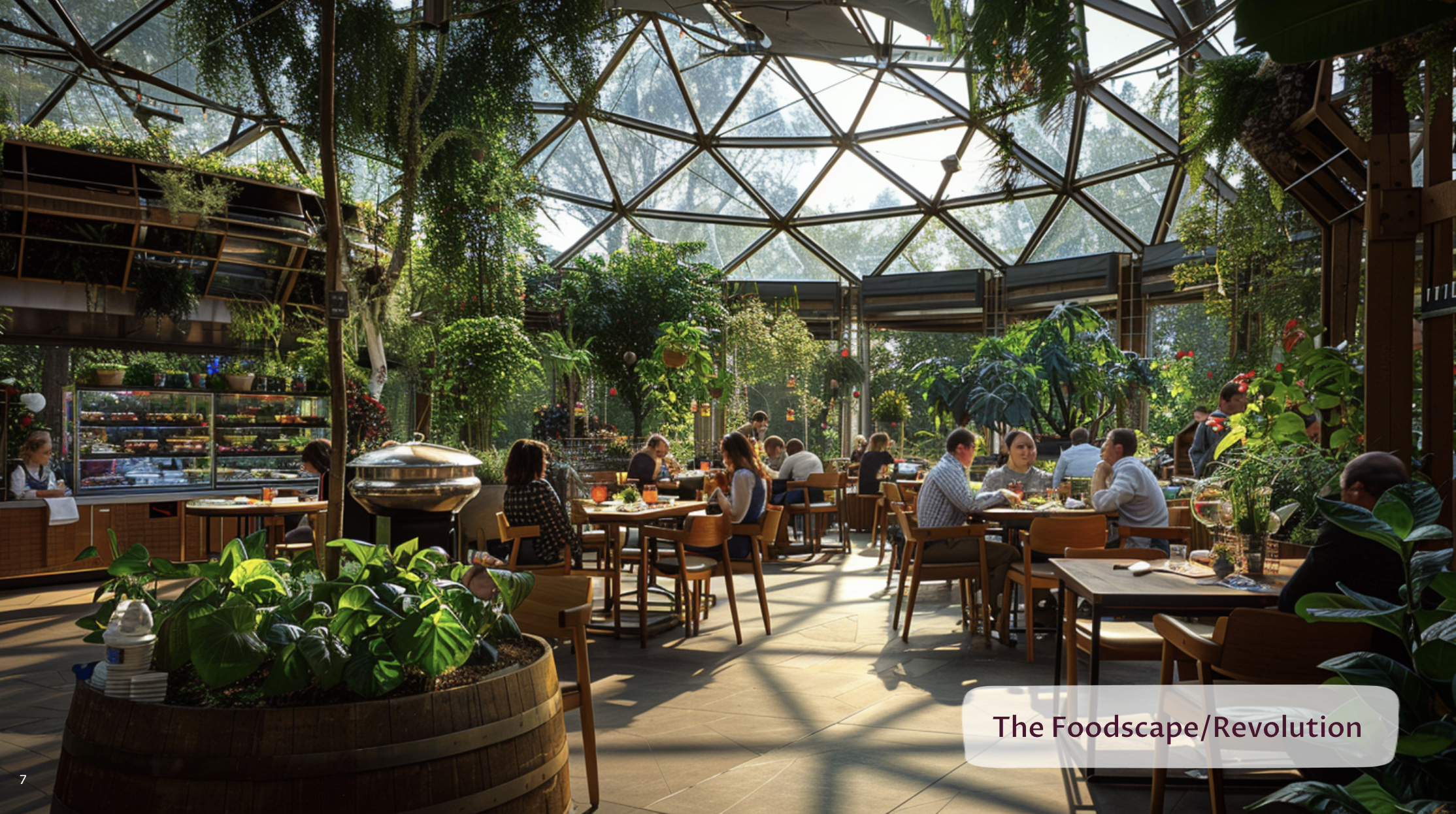
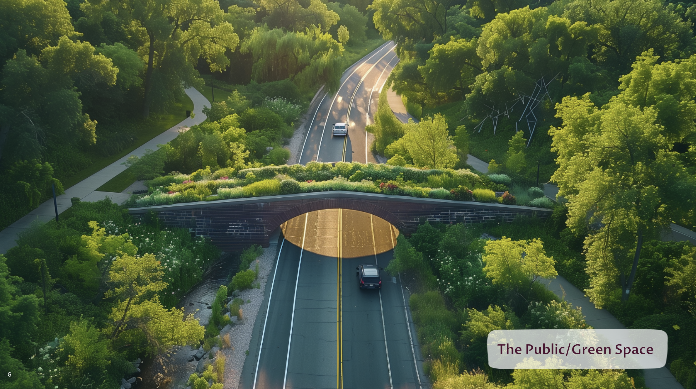
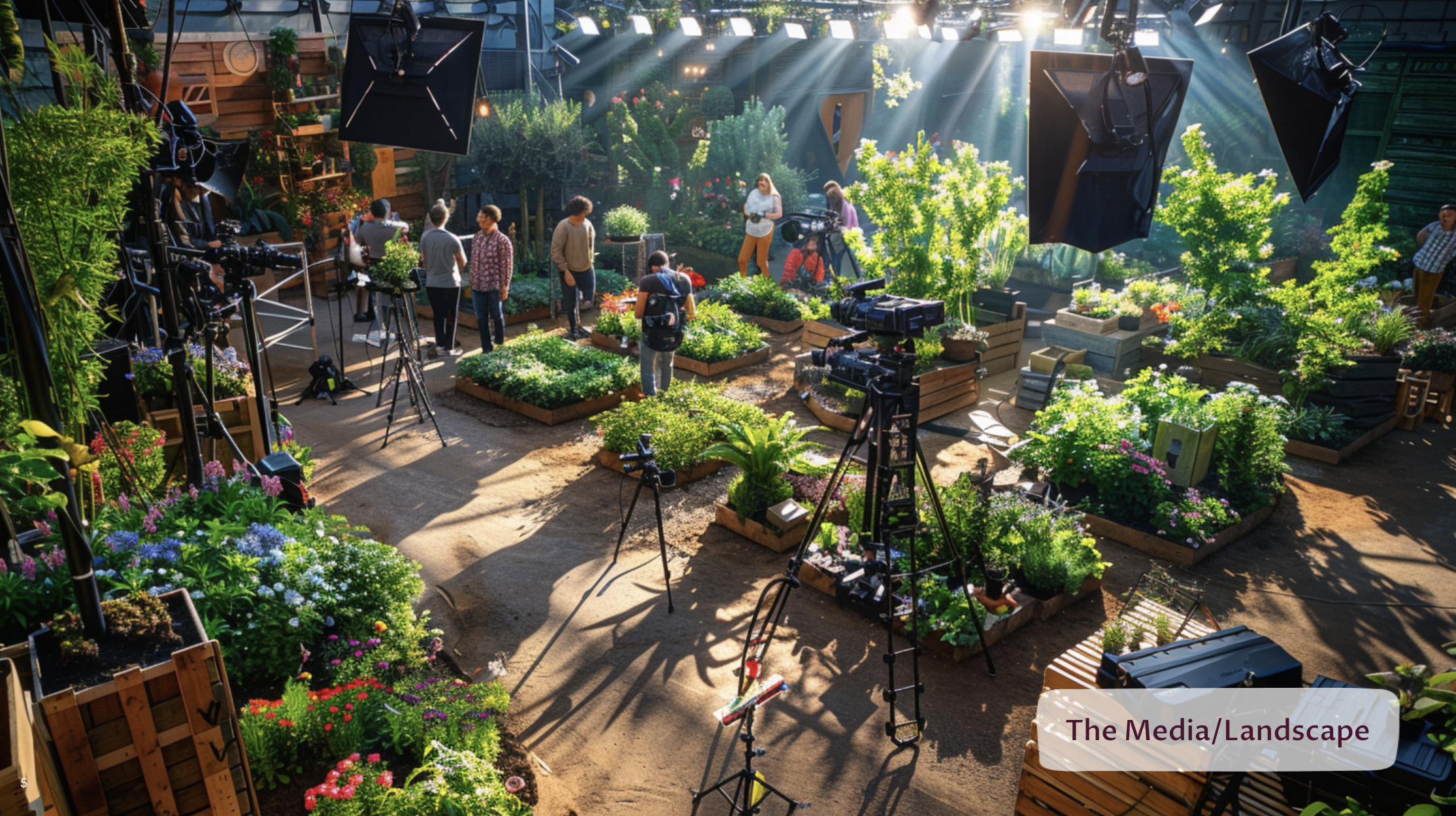
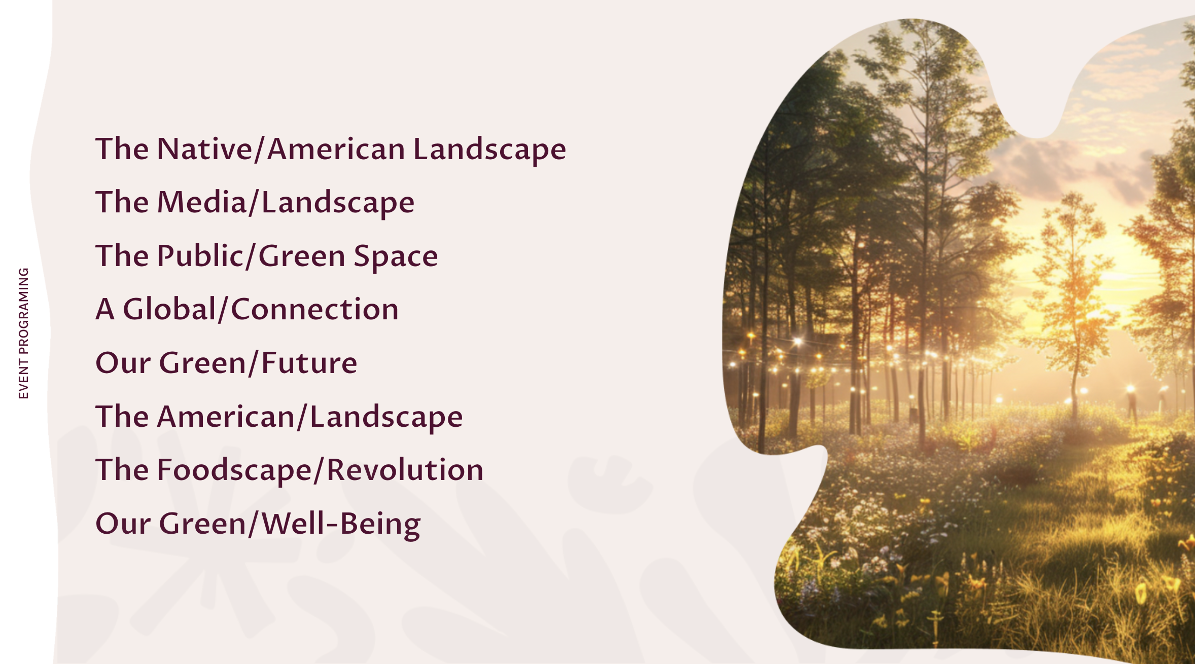
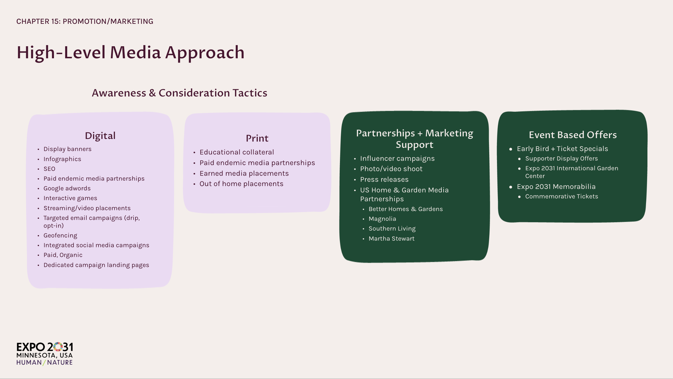
Event Programming Map
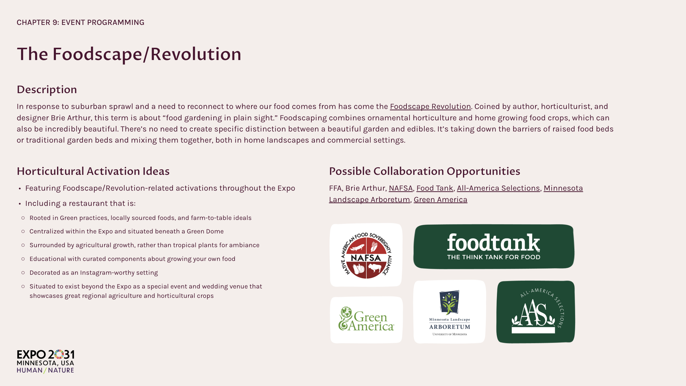
The Program Map tiles reveal breadth at a glance—Native/American Landscape, Media/Landscape, Public/Green Space, Our Green/Future, American/Landscape, and Foodscape/Revolution—each with a one-line why, activation ideas, and partners.
The design system keeps everything cohesive: Inter type, accessible color tokens, rounded cards on a 12-column grid, and gentle motion for pacing.
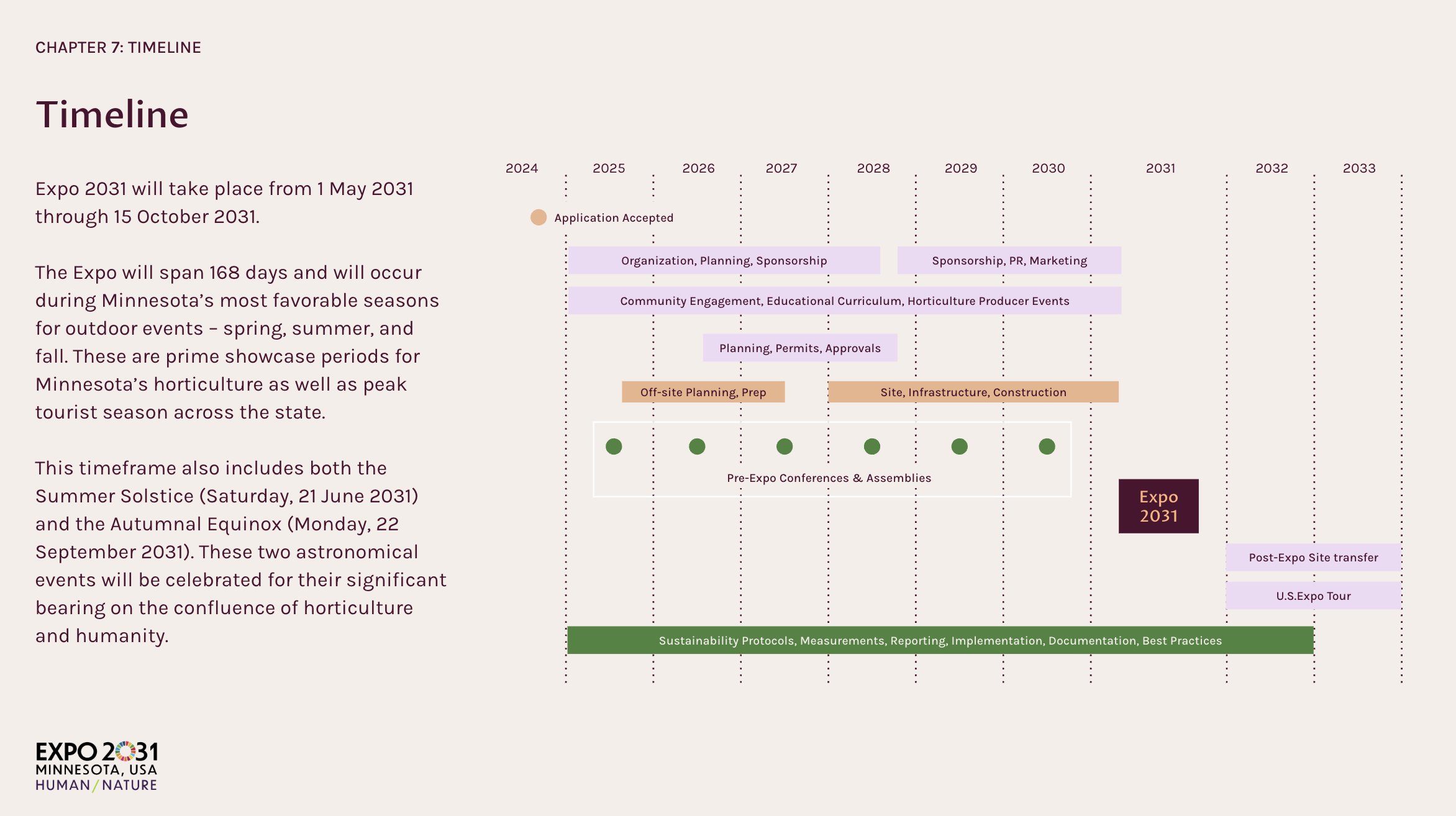
Evidence chapters cover visitors, transport, finance, and legacy with standardized charts and tables.
The result is a persuasive, scalable deck that turns a massive vision into a clear plan, and helped position Minnesota to host the world in 2031.

Design presentation modules.
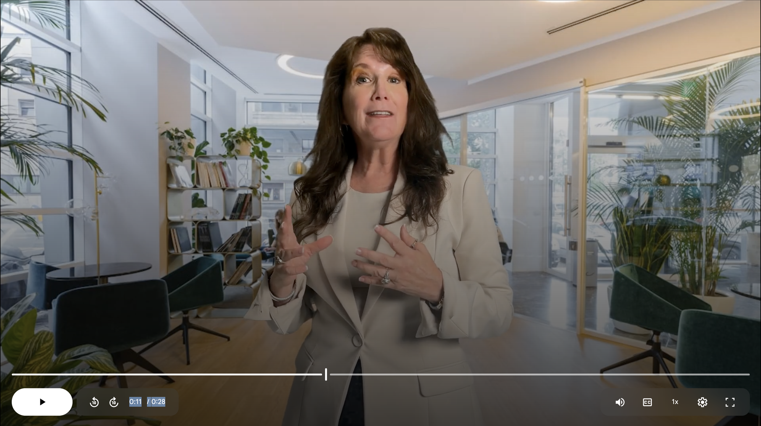
Personalized Avatar:
I utilized an avatar agent platform to transform approved headshots of Expo 2031's CEO into short, spokesperson-style videos, delivering key Expo updates quickly, consistently, and at scale.
This approach put a trusted human face on communications while avoiding new shoots—so messages could be produced, revised, and localized in hours instead of weeks.
Why does it help the Expo
Speed & agility: Rapidly release announcements, partner calls‑to‑action, and event updates without coordinating filming.
Data‑driven iteration: A/B test scripts, intros, and CTAs; update clips as plans evolve.
Consistency: One voice and look across web, social, email, and kiosks—easy to keep on‑brand.
Cost‑effective scale: Produce many tailored clips (city partners, sponsors, themes) without studio costs.
Accessibility & compliance: Add captions, control messaging.
Global reach: Generate versions in multiple languages to engage international stakeholders and visitors.
Results
Minnesota is now the location for the A1 World Horticultural Exposition!
This is also the first time it has been located in the USA.
Faster read‑throughs and tighter executive reviews—chapter openers and legends make scanning effortless.
Future‑proofing: New content drops into the grid without reinventing layouts.
Higher confidence across evidence sections (program, visitors, transport, finance) presented as one cohesive system.
Summary of Human/Nature
I led content architecture and visual‑system design for a complex Expo proposal—codifying color, type, spacing, iconography, charts, motion, and accessibility into a presentation system that feels as cohesive as a product design system. The work supports Minnesota’s push to host America’s first A1 World Horticultural Exposition, turning a massive story into something people can feel quickly and act on confidently.


